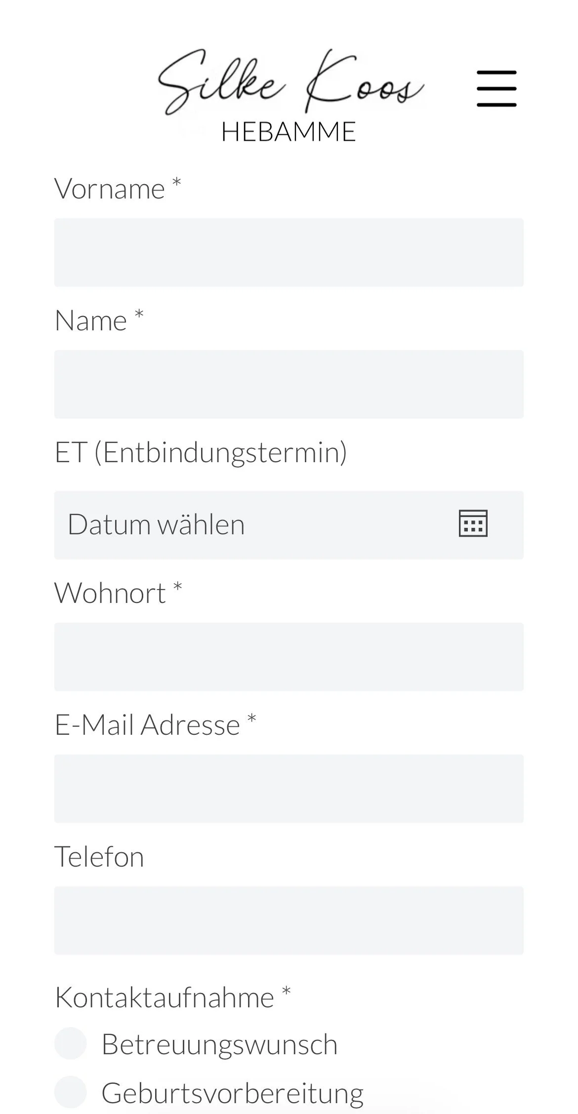
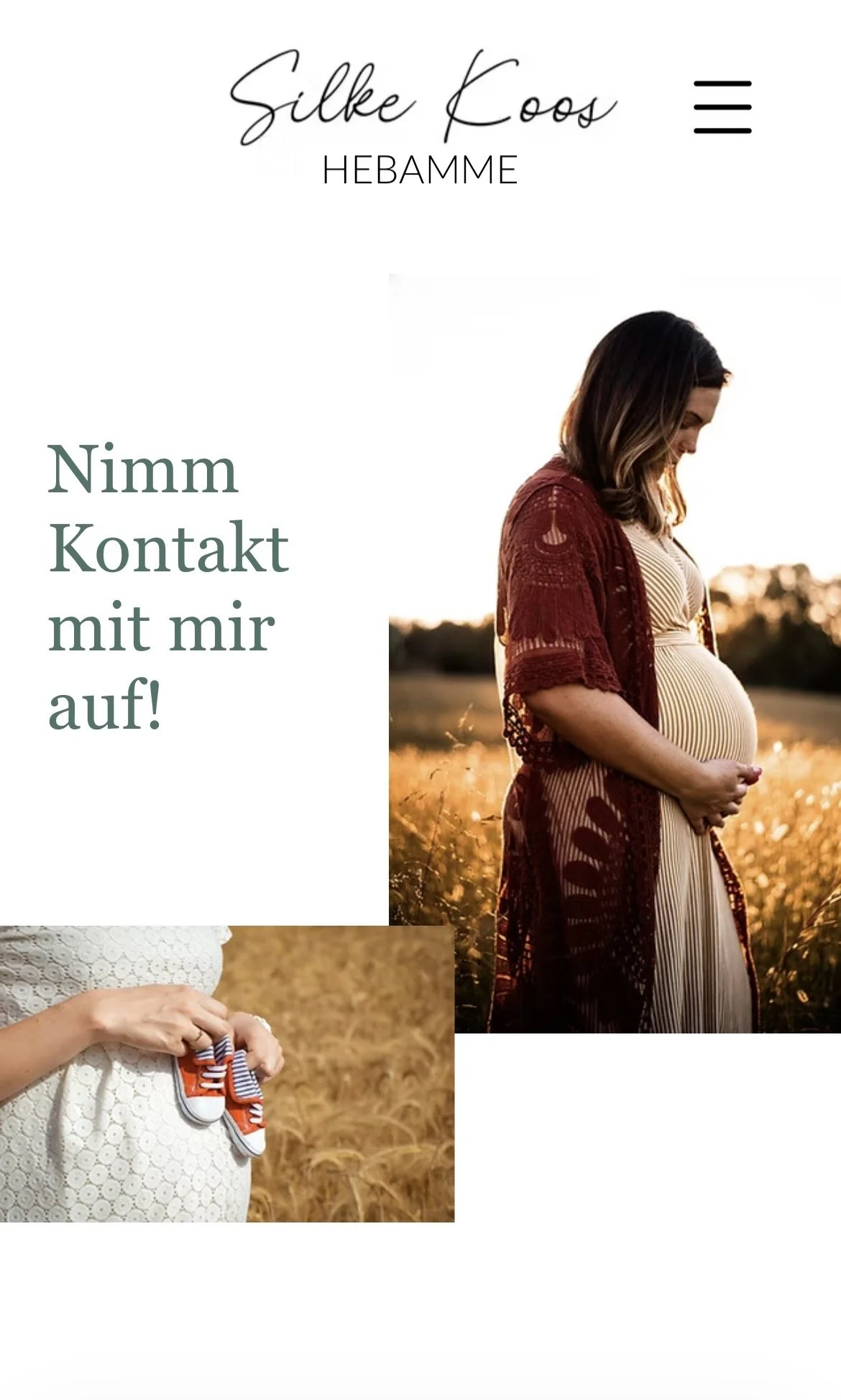
Midwifery Practice Website
A responsive website for an independent midwife, designed and built from scratch.
The Brief
We started with an interview — what she wanted, what she needed, her expectations.
My Process
Interview: to understand needs and expectations from the site
UX Research: interview with a newborn mother, to bring user's perspective
Key finding: people need availability and location fast — the site had to be mobile-first and easy to scan
Market research: analyzed other midwife websites — colors, images, sections, content
Brief: refined together with her, based on the research
Web builder: gave her options, she chose Wix
Sketch: a direction that didn't feel prefabricated; she picked the style and colors that represented her
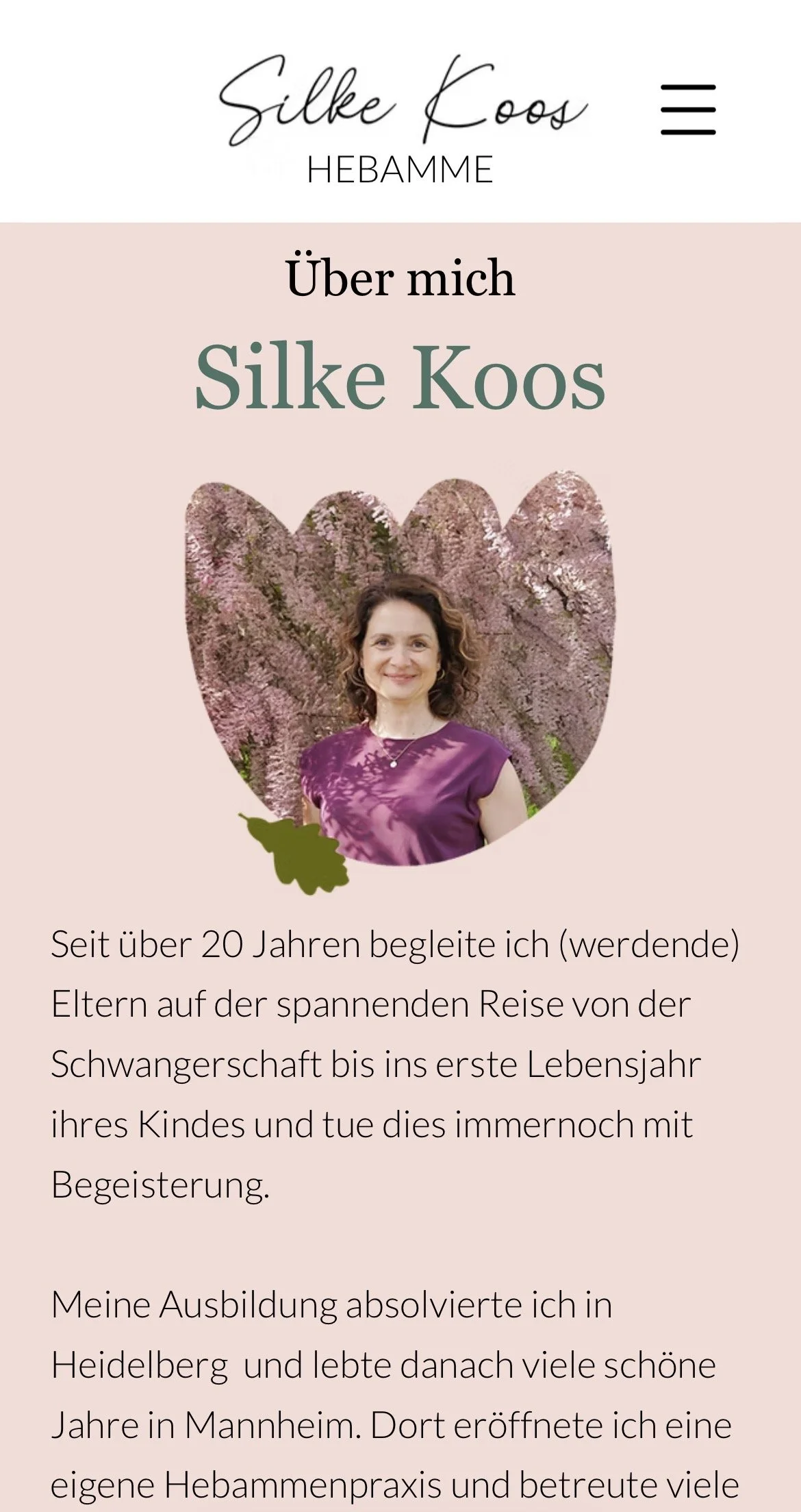
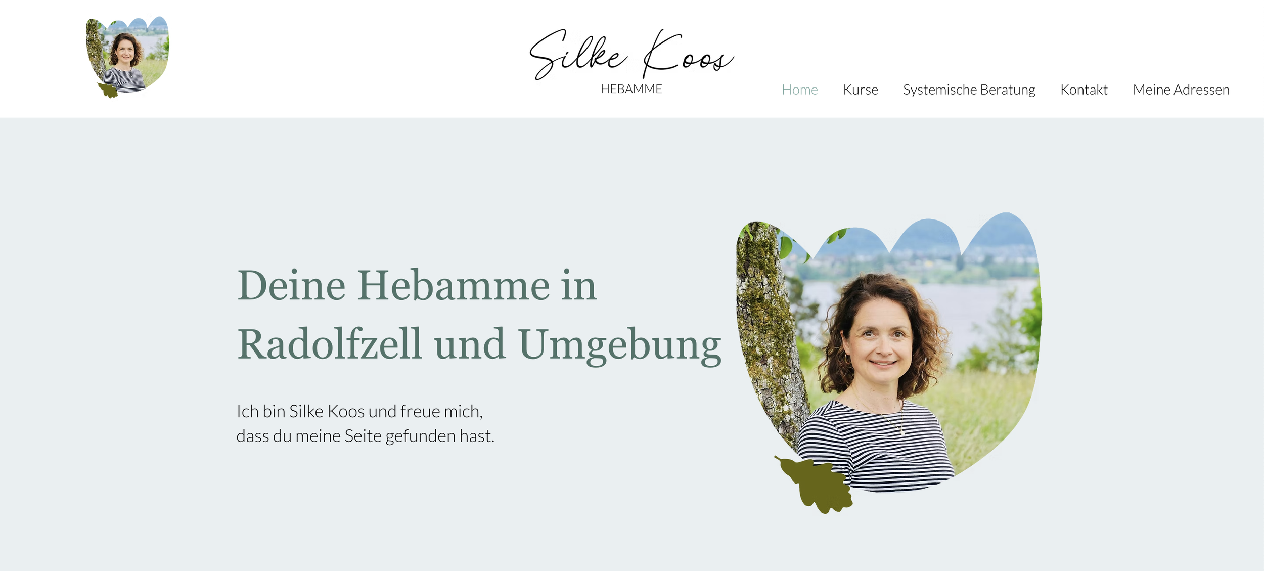
The Result
The site has been live for over two years now. She was very happy with it. She wrote the copy herself — having her own voice and personality in the text mattered, especially when you work this closely with people, in this case midwifery patients and expecting families.