Calm Design Concept
The Problem
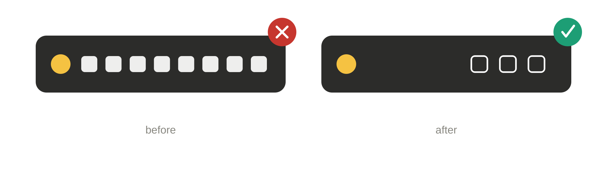
This project is part of my work for a B2B IT automation platform used daily by IT administrators to manage requests, schedules, and approvals across their organization. The task came in as a user story — part of an ongoing, progressive effort to improve usability across the portal. The utility bar (top-menu) had grown organically over time, as happens naturally in mature products. The result: duotone icons adding unnecessary visual weight, no tooltips to clarify what each icon did, and no conceptual grouping — just accumulated clutter with no underlying logic.
My Process — Validating with Theory
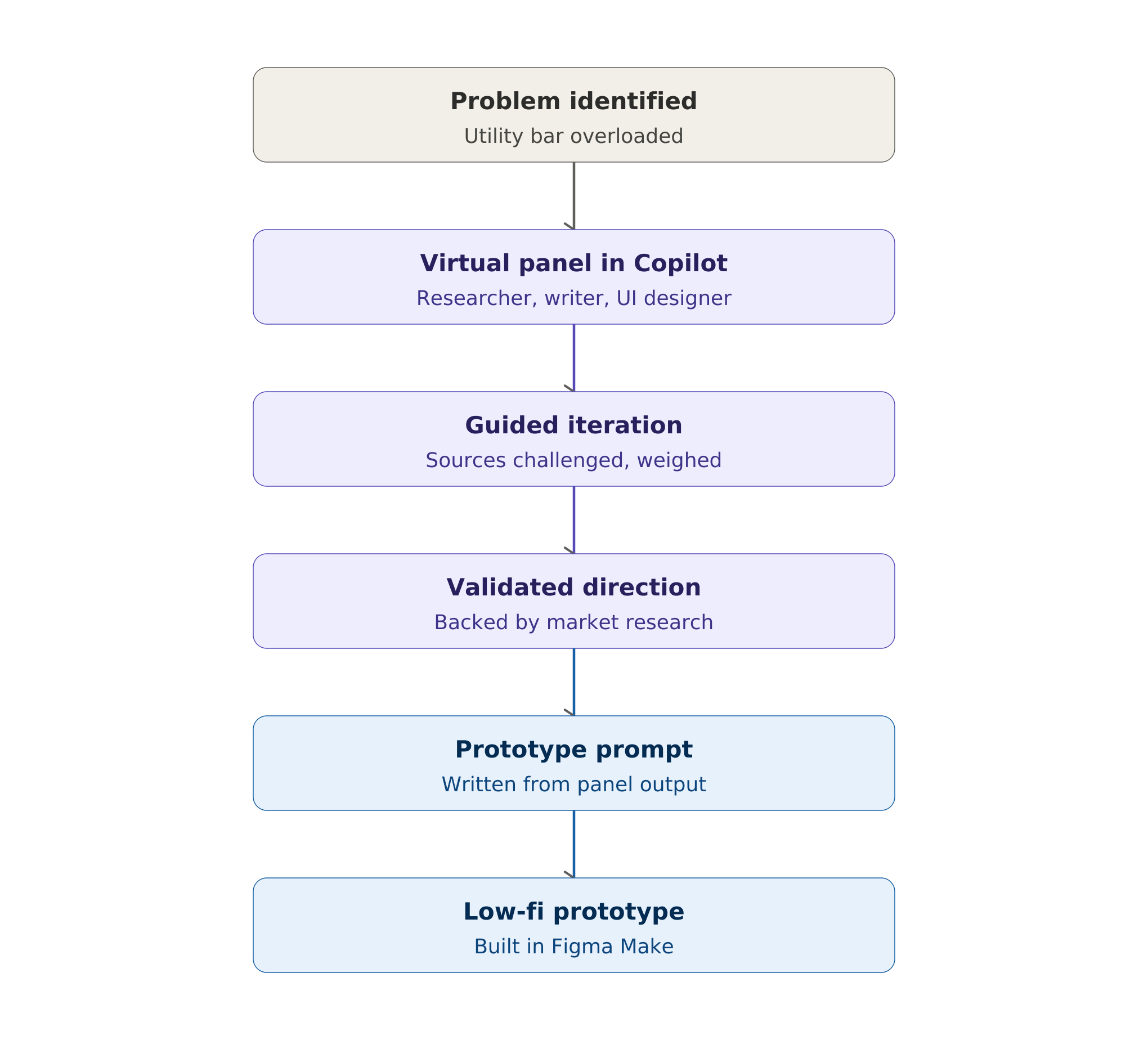
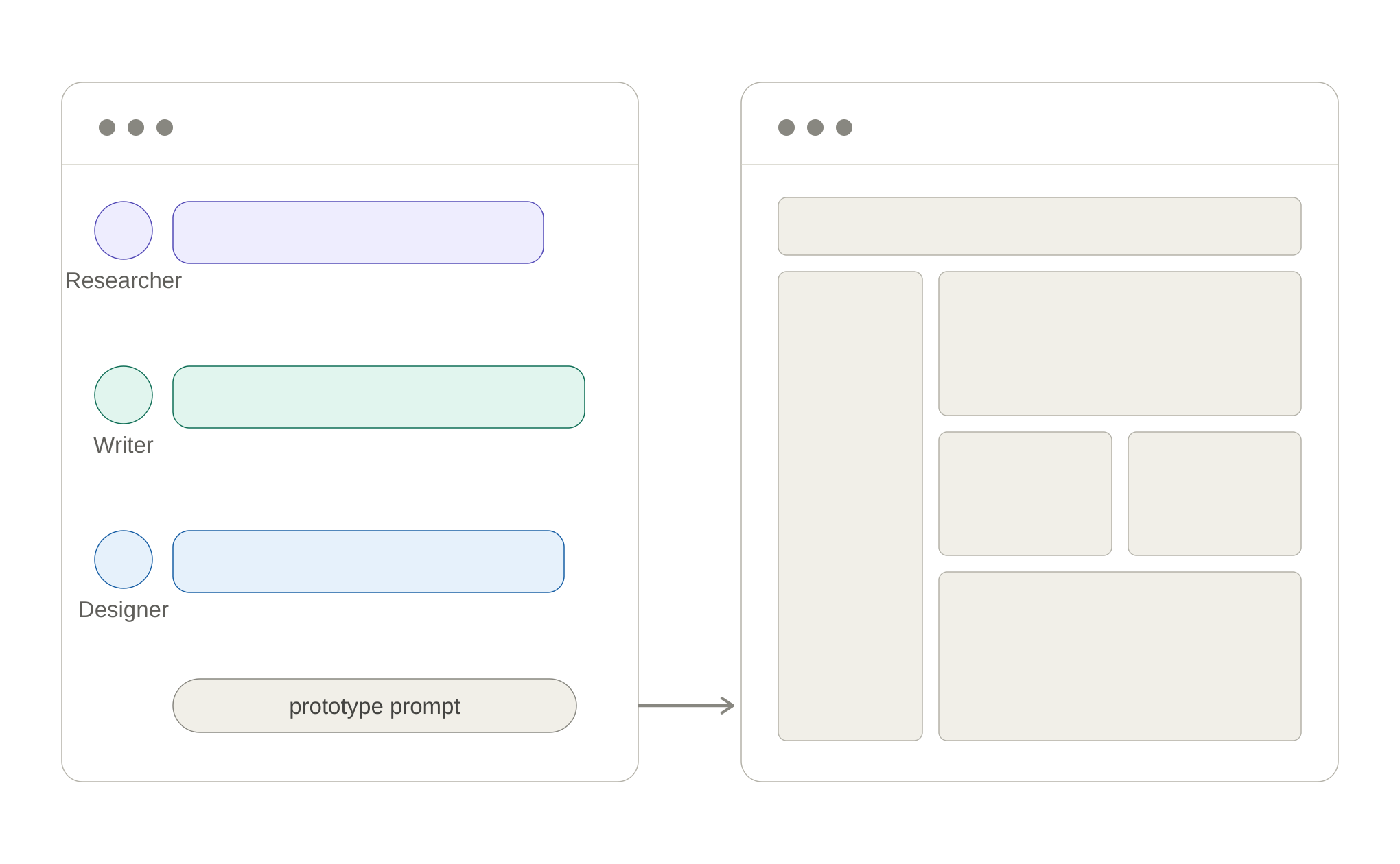
With no usage metrics available for a project this size, I chose theory-based validation over a data-driven approach — a different tool for a different context, not a fallback. I put into practice something I'd been exploring since taking a Prompt Engineering course — a structured virtual panel in Copilot with three roles: UX Researcher, UX Writer, and UI/UX Designer. I have hands-on experience in all three myself, but the value was in hearing each perspective distinctly — leading the discussion, providing context, pushing each role to cite its sources, and weighing them against each other. As the conductor of that conversation, I shaped the roles' input into a direction I could stand behind.
Complementary Research — Market & Competitive Analysis
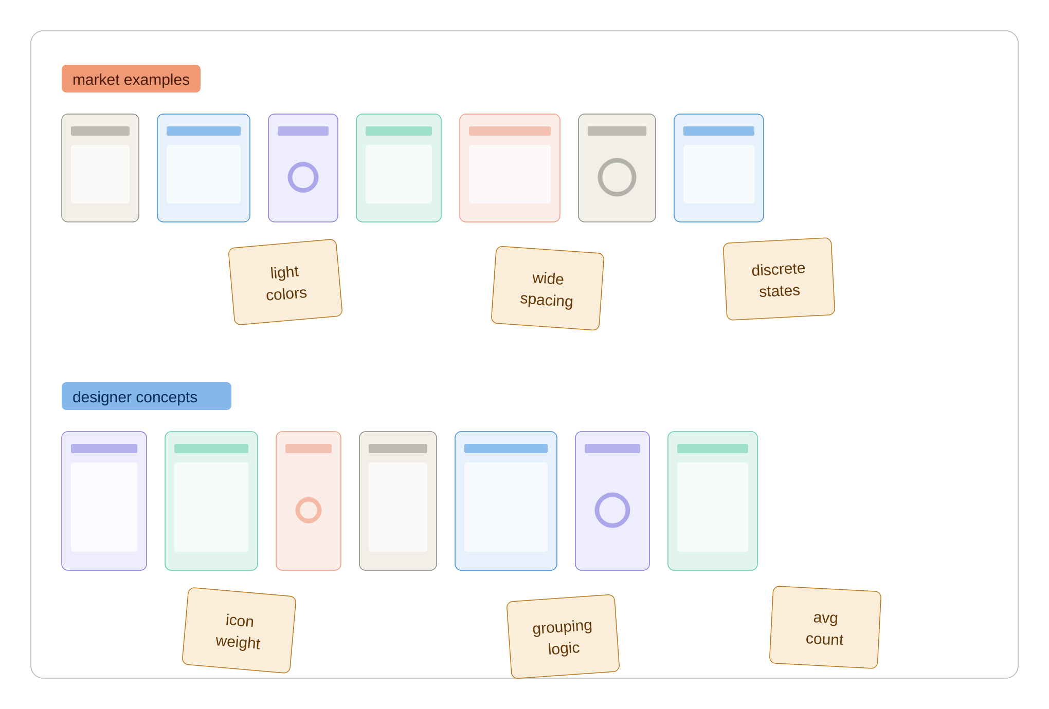
Using Miro, I collected and analyzed screenshots of how other products solve similar problems, mapping patterns across them: icon styles trending from regular to light weight, light and clear UI colors, subtle/discrete active states, and generous spacing between elements — all contributing to lower cognitive load. I also looked at the average number of elements and how they were grouped and ordered.
Two changes stood out as things to test immediately: fully separating the top utility bar from the main left-hand menu, and giving the main menu more breathing room between elements. Together with a shift in icon style, these gave me a clear direction toward cognitive clarity and calm UX. Competitive analysis was just as useful for showing me which direction not to take.
User Context — Built Over Time
My understanding of this user didn't come from a single project — it's accumulated. I've built personas together with the Customer Success team, analyzed recordings of product presentations to users, and — most valuably — spent a full day shadowing a user directly in their real work setting: watching everything they did, asking questions in the moment, and taking notes to process afterward. That immersion shaped how I think about this user far beyond any single research session.
Result — From Presentation to Iteration
In an initial review, the PO asked me to incorporate a feature already planned for a future release — a switch that lets the main admin preview the UI as it appears to a role with delegated permissions. I added it to the low-fidelity Figma Make prototype, applying the patterns I judged most appropriate. The PO responded well to the solution, and specifically called out the role-based grouping as solving a real pain point.
In the follow-up presentation with the CEO and PO, the conversation opened up further — ideas like making global search more prominent, expanding functionality, and connections to other features across the product. Throughout, I was asked directly: "As the expert, would you include or recommend this?" — a sign the concept had earned real trust in the room. An early example of what NN/Group has since termed "UX-context design" — curating research and context to guide AI-generated exploration, rather than producing documents for humans to interpret.